Dropdown
No accessibility annotations are needed for dropdowns, but keep these considerations in mind if you are modifying Carbon or creating a custom component.
What Carbon provides
Carbon bakes keyboard operation into its components, improving the experience of blind users and others who operate via the keyboard. Carbon incorporates many other accessibility considerations, some of which are described below.
Keyboard interactions
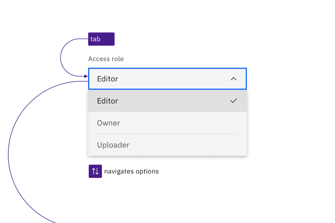
A dropdown component and its variants multiselect and combo box are reached by
Tab, with navigation of the options by Up and Down arrow keys. However,
the keys for opening the component and selecting its options are different for
each variant.

Dropdowns are in the tab order and operable by Up and Down arrow keys, once opened.
Dropdown
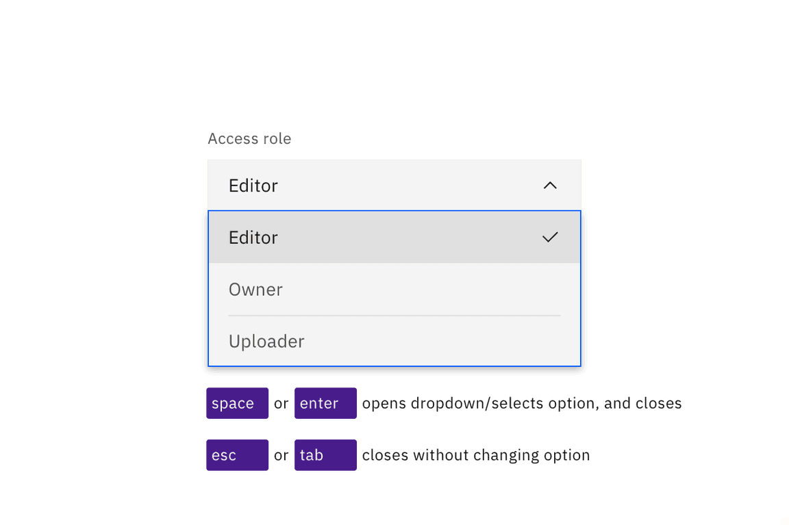
The default dropdown opens with Enter, Space, or Down arrow, with focus
moving to the currently selected option. Arrow keys change options, and any
option with focus is selected with Space or Enter, which also closes the
dropdown. Pressing Esc or Tab closes a dropdown without changing the
selected option.

The Space and Enter keys can be used to open dropdowns and also select an option with focus. Esc cancels and closes the interaction.
Multiselect
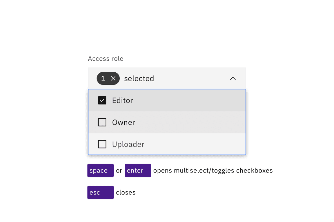
The multiselect opens with the Enter or Space keys, which are also used to
toggle the selection of any option. Once items are selected, a tag appears in
the field, showing a numerical representation of the number of items selected
along with an ‘x’. Pressing Esc closes the multiselect. Pressing Delete
while focus is in the collapsed field will clear all selected options.

Space and Enter keys open multiselects and toggle the state of the checkboxes in the list. Esc closes the list.
Combo box
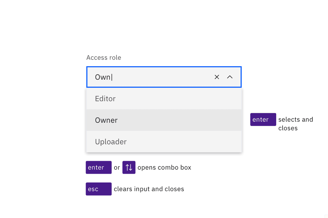
The combo box’s operation is quite different, since it is a combination of a
text input and a dropdown. Enter or the Up or Down arrow keys will open
the list of options, as will typing any character or string of characters (which
will also filter the list to only show items that match the typed string).
Pressing Esc will clear the input and collapse the list. Pressing Enter will
select a highlighted option and collapse the list. (If nothing is highlighted in
the list, pressing Enter will toggle the combo box open and closed.) Space
cannot be used for selecting, as pressing it will submit a space character into
the filter string.

Combo boxes can be opened with the Enter or Up and Down arrow keys. Enter selects the highlighted option in the list. Esc clears the input and closes the combo box.
Development considerations
Keep these considerations in mind if you are modifying Carbon or creating a custom component.
- The dropdown and multiselect variant use a
buttonwitharia-haspopup="listbox". - The combo box uses an input with
role="combo box",aria-autocomplete="list",aria-haspopup="listbox"andautocomplete="off". - The combo box uses
aria-controlsfor a div withrole="listbox". - All variants use
aria-expandedto track the state of the listbox. - See the ARIA authoring practices for combo box for more considerations.